OpenDNS Home Page Redesign

Project Summary
Project Name: OpenDNS home page optimization and redesign
- Target Audience: IT and security professionals
- Project Goal: To showcase OpenDNS's new services and better address different user types with different needs
- Steps: Defining Goals, Brainstorming & Ideation, User testing, Interaction & Visual Design, Implementation, Performance evaluation , Iteration, UserTesting
- My Role: User experience designer, Visual Designer
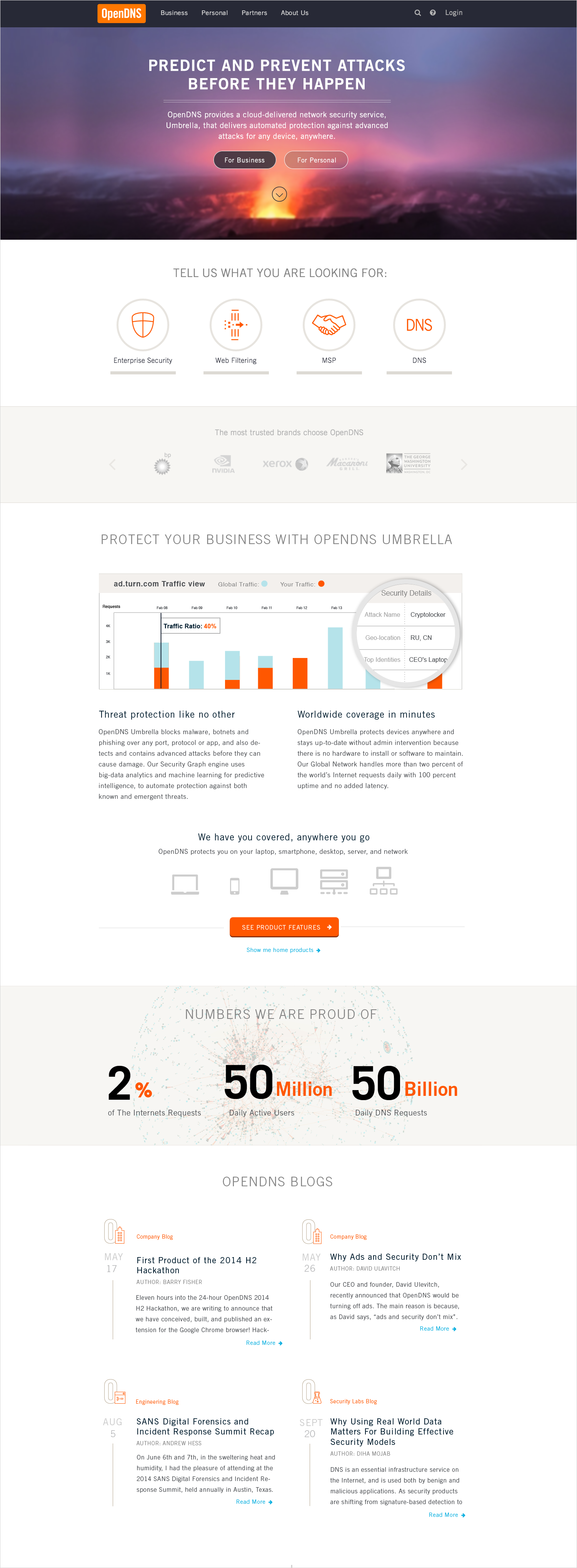
Home page prior to redesign
Defining Goals
We started the project by putting together a list of goals that we wanted to achieve through this redesign. The list was shared with, and, after a few tweaks, approved by all the executives.
Most of our objectives were standard such as: Showcase highlights of our services; lower bounce rate; increase conversion rate and etc. But, I was most excited about the following two objectives, that we had established after considering the particular needs of our business. They listed below:
- Help users with personal or business security needs get to their relevant section with ease.
- Furthermore, separate different types of buyers with business security needs in order to direct them to the content relevant to them. We could separate our business audience either based on industry, or user’s role in the company. We were not sure which way to go, so we decided this would be a great candidate for A/B testing once the new home page has gone live.
Brainstorming & Ideation
For the project kick off we went for a two day offsite boot camp, where we used “Design Thinking Methodology” in order to brainstorm, and come up with new ideas as a team.
The goal for this offsite camp was to make two interactive mockups that meet all the objectives, and are live and ready for user testing by the end of day two.


Concept
After four hours of quick ideation, we came up with a lot of great ideas. We used “Design Thinking Methodology” in order to evaluate and prioritize each idea.
Then we translated the winning ideas into visual UI elements using sticky notes and sharpies. By the end of the first day we had two different concepts fully sketched on two big sheets of paper and ready for wireframing.
Testing
On the second day we split into two groups. Within one hour, we took the concepts from the sketches and turned them into interactive wireframes using Omnigraffle and Invisionapp.

After we set up user tasks, the wireframes went for evaluation on usertesting.com. The audience recruited for this test were either users with personal or business needs.
We had done a couple of rounds of revision and testing by the end of the second day. Both versions, along with a summary of user testing results and a few insightful snapshots of the videos, got emailed to the executive team.
Interaction & Visual Design
On the third day, we were back in the office with two great wireframes. But, due to technical complexity of concept 2 , lack of resources, and time sensitivity of this project, we decided initially to build concept 1 and once it’s completed and live, build the second concept and compare their performances.
Using Illustrator and photoshop, I put together the first close to production quality mockup. Once the stakeholders signed off on the general look and feel of the page, I moved to refining the details, and defining interactions and transitions.

Coding & Limited Release
Having the page structure and behavior finalized, the home page went for coding. With the effort of two of our great engineers it was ready to go live after a week.
In our team, we saw the necessity of evaluating the performance of the new home page, before we made it available to the public. The decision was to set only 10% of the traffic to the new home page and monitor it closely. Given the average number of unique home page visitors per day, we knew that by the end of the two weeks of collecting data we will have statistically gathered significant data to be able to measure the performance of the new design.
Performance Evaluation
Through a brief meeting with our director of demand generation and our head of UX, we confirmed the list of parameters we were going to monitor. Below are a few.
- Bounce rate
- Level of engagement in the Business segmentation section (Tell Us Who You Are)
- Contact sales form submission rate
- Contact sales form conversion rate
- Lead's quality (The dollar amount associated with each lead)
- Home user sign up
- Total business CTA clicks on the Hero image
Tools that we used:
- Google analytics
- Salesforce (Visibility over lead and conversion stats)
- Crazy Egg: (Measuring user’s scrolling behavior)
Results
After two weeks of collecting data, it was obvious that the business segmentation section at the bottom of the lower part of the page was suffering:
User's engagement and click rate in “Tell Us Who You Are” was significantly lower than “For Business" CTA at the top.


Analysis
We didn’t know exactly what was discouraging the users to move forward, however I had an applying hypotheses, that we needed to test.
The executives had a very strong opinion that since our business customers had varying needs based on their professional field, our segmentation on the home page had to reflect the different professional fields in order to appeal to our business customers.
I had a different idea:
What if the professional fields of our customers do not resonate with what they are looking for? What if, like many other eCommerce websites, our customers have specific needs in mind when they come to our website?
The segmentation on a Website like Amazon is not based on whether the customers are students, or athletes; it reflects their needs.
In that case, the best segmentation for our website would also reflect the needs of our business customers, and not their professional fields.
A/B test
Using Optimizely we ran different A/B and even C tests each for the duration of two weeks to see the effects.
Results
After a month of different A/B tests, it was clear that approaching the users based on their needs, instead of their professional fields, dramatically increased the level of engagement and click rate in the business segmentation section.

A/B testing, if done right, not only allows designers to validate their hypothesis but also it’s one of the best ways to get executives on board with approaches which otherwise they might be have highly opposed.
This was not the first and will not be the last optimization; optimization is an ongoing process.